


Lead a small team for Denizens Brewing Company's rebrand from top to bottom.
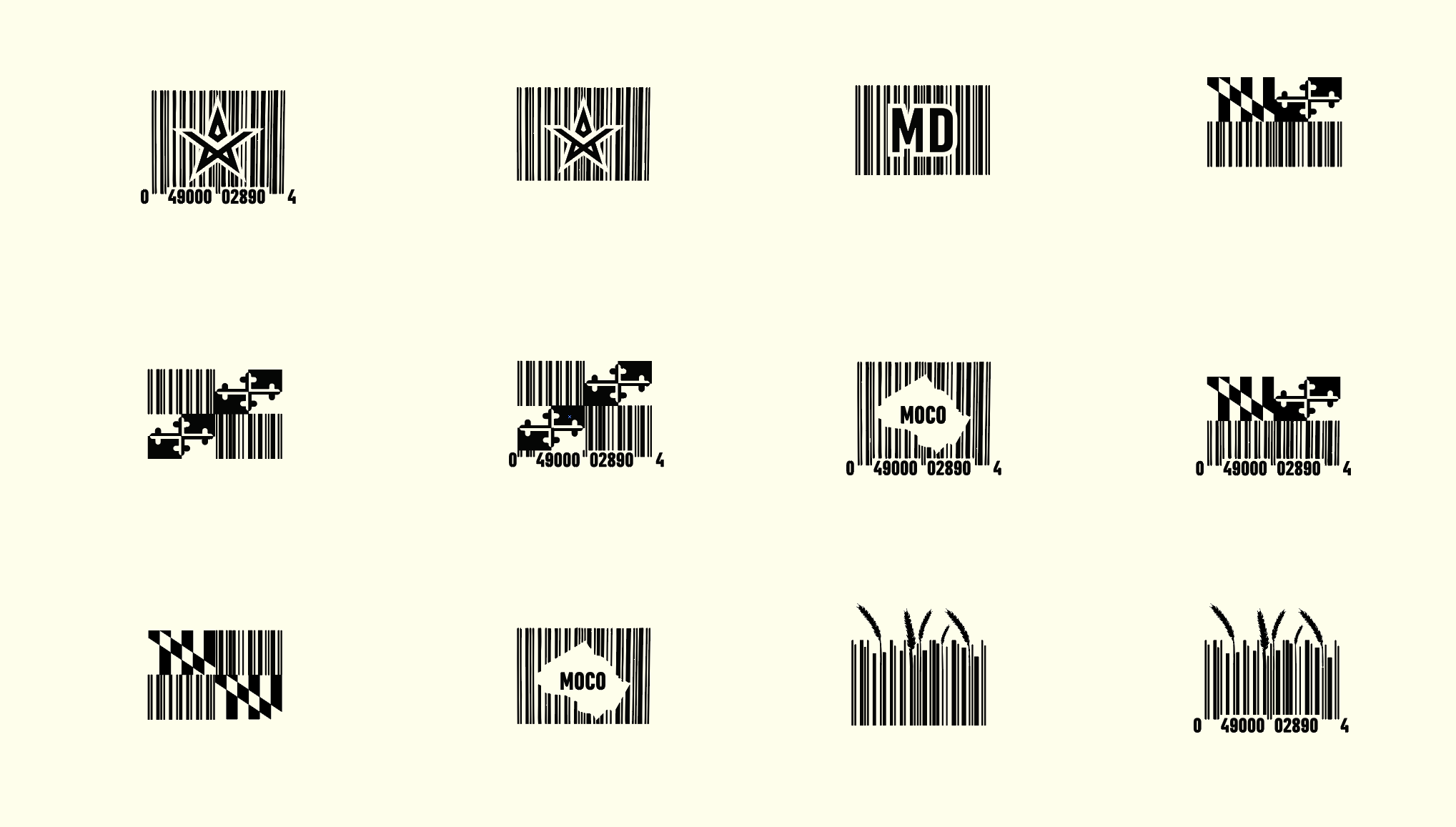
For the redesign of the logo, we wanted to carry over elements from their previous logomark . We landed with the star not only for its identifiable nature, but it’s a nod to their DC roots. A ‘d ‘and ‘b’ is incorporated and bisects the logo. Overall, the new logo is simplified, cleaned up and easily translated to various mediums.
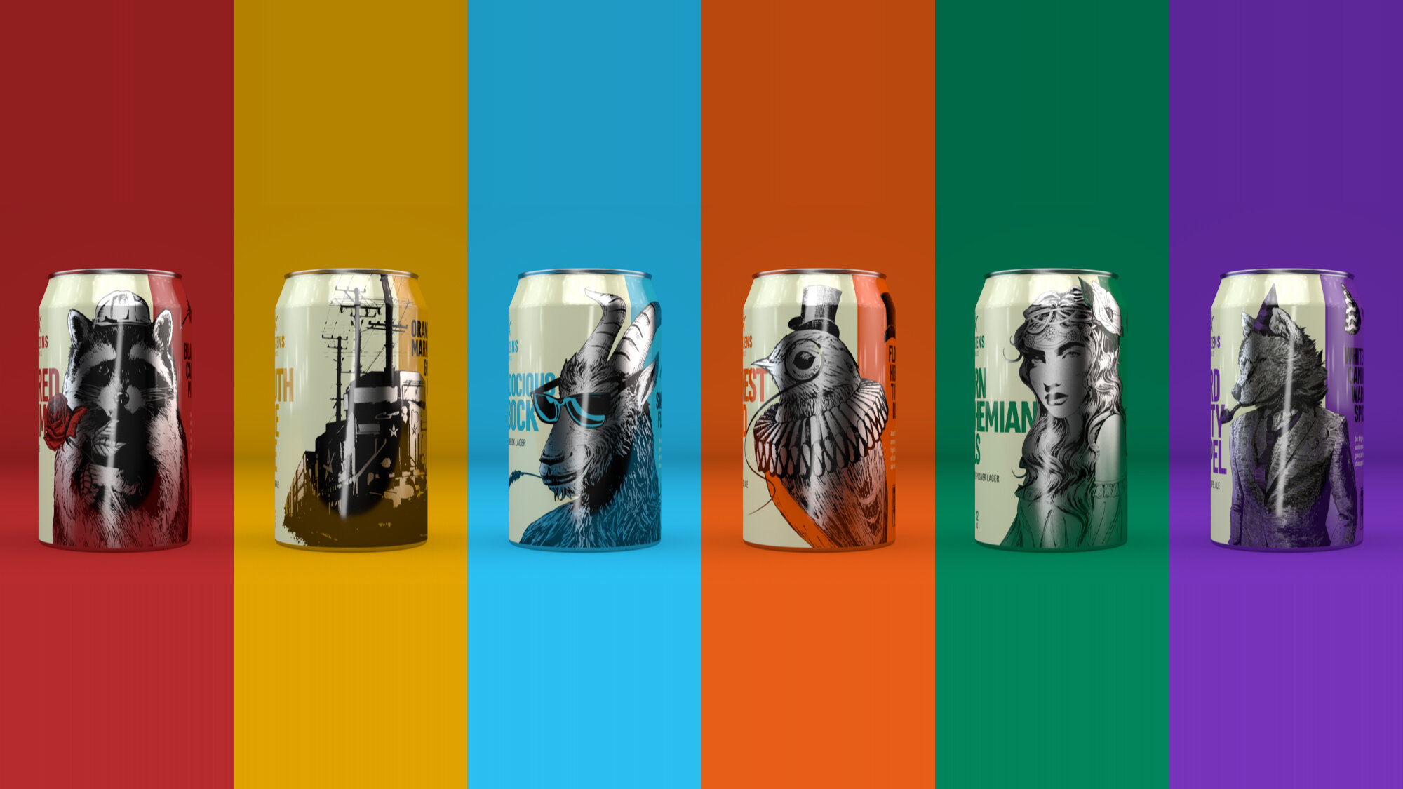
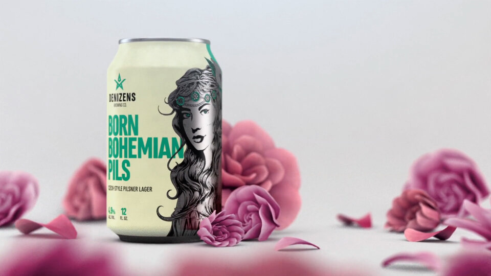
From the start we wanted the beer can designs to be bold, fun, and easily recognizable as a Denizen’s Brewing Co. beverage. Along with a suite of Pantone colors for each of their core beers, individualized illustrations that represented each beer were developed.
The construction of the cans was rather simple. The illustrations were matted out so the underlying aluminum of the can shown through, giving some neutral tones to balance the colorful cans.